Learning The Basics Of Graphic Design: Our Top Tips
Graphic Design is an industry which has really taken off in recent years, thanks to all the latest developments in computers and modern technologies. In 2022, there is a vast array of graphic design software tools available that simply weren’t around a few years ago when designers stuck to using their trusted pen and paper for work. Fortunately, being a graphic designer is also a job you can do from absolutely anywhere, and thus a perfectly suitable profession for anyone wanting to work remotely full-time. Once you get a few years of experience under your belt, you can earn a decent salary working as a graphic designer in the UK. Regardless of all the digital technology around today, in order to be a top designer, you must first make an effort to learn the basics. Therefore, we’ve decided to come up with this piece on our top tips for learning graphic design basics. Carry on reading to learn more.
Apply The Fundamentals Of Colour To Your Work
Colour theory is the rules and guidelines designers use to communicate with users through colour schemes in visual interfaces. In order to select the best colours, designers use a colour wheel and refer to their knowledge about human optical ability, psychology, and so on. If graphics are being used for online marketing purposes, for instance, which colours will successfully attract users’ attention and persuade them to buy the products or services being advertised? So, if you want to become a trusted, skilled graphic designer, you should learn all about colour theory and the fundamentals of colour.
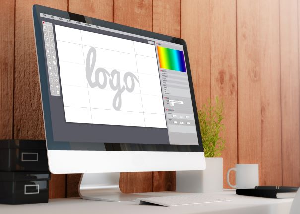
Try Different Image-Editing Techniques
Image-making techniques will have different effects and, in turn, cause your graphic images to come out completely differently.
Layers are one digital image editing technique which is usually used to separate different elements of an image. You can layer a digital image on top of another using basic graphics editing tools. Filters are another image-editing tool that can be used to make any digital image look better. For instance, filters can easily smooth out the wrinkles of an image of the faces of 2 smiling elderly people. On the other hand, solarisation is a tone reversal editing technique to make dark areas appear light or light areas dark.
As a graphic designer in 2022, you need to be aware of copyright laws when trying to download and re-use online images. You could pay a hefty fine or ruin your reputation as a professional. Sometimes you will encounter technical difficulties when trying to edit images you’ve come across online. Perhaps you are unable to convert an image that you want to put in a different format? In that case, this JPG to PDF converter could come in extremely handy for you.
Use Lines To Convey Meaning In Your Designs
Depending on their length, width, positioning and so on, lines can help organise information, define shapes, imply movement, and express emotions in your designs. Manic, scribbly lines can convey confusion and disorderliness, whereas zig zags may express danger or anger.
How To Work With Different Shapes
Anyone with an ambition to become a skilled paid graphic designer needs to learn how to work with all kinds of shapes, from regular geometric shapes to more irregular ones that are less proportional and more ambiguous. Different shapes carry different meanings and connotations when used in images. For instance, triangles are often associated with civilisation, history, and power.
Develop An Awareness Of How To Represent Texture
Conveying textures to viewers is a challenging task for graphic designers since viewers aren’t actually able to touch and feel their images in person. However, texture can easily be represented by adjusting an image’s colour saturation and transparency levels. Want to represent an amazing background effect for one of your images? Make sure you hone your textural editing skills as a graphic designer.
Experiment With Different Text And Letter Forms
Using the same flat typography all the time can get pretty dull. Why not switch things up by experimenting with different text and letter forms? Textured typography can produce fun, 3-D effects. Interesting, eye-catching text will help to make your work stand out. In fact, using a specific type of typography could make your work unique and easily recognisable to clients and the industry you work in. Why not produce an exciting type of text that manages to instantly attract people’s attention and becomes your USP as a modern graphic designer? There’s nothing wrong with trying your best to stand out from your competitors and creating a unique brand as a designer. One of the basics of graphic design is to try and use as much variety as you can, and experimenting with different text and letterforms definitely helps you do that.
So, these are our top tips on how you can learn the basics of graphic design. The rest is up to you to hone your trade and ensure you continue to pick up new skills as you advance in your career as a graphic designer.